This project is focused on redesigning Zara’s website in order to
enhance the online shopping
experience for fashion-forward
millennials. Zara’s current website is filled with a large amount
of
collections, seasonal or otherwise. The website is updated every
two weeks with new up to date
fashion trends. We found that the
amount of information and the way it is currently displayed is
more
difficult to navigate than it should be, discouraging consumers to
from shopping online. The
initial goal for their website redesign was
to restructure the navigation to a more modern and
minimal layout.
Through personal experience and research, we realized that online
shoppers
struggle with trusting companies that don’t have transparent
and realistic images/reviews. We began
to think of how we might
also add features to the website that would help Zara customers
feel
more confident about their online purchases.
UX Research, UX Designer, UI Designer
Github, Adobe XD, Figma, Miro, G Suite, Trello
February 2021
Zara is one of the biggest international fashion companies
with nearly 3,000 stores in 96
countries. Zara’s brand value is
an estimated $14.7 billion, and the fast fashion retail
giant
generated $21.9 billion in sales as of June 27, 2020. Zara
operates its stores and
online platforms under four core
values: beauty, clarity, functionality and sustainability.
We intend to redesign the Zara website in a way that makes
the e-commerce experience more
intuitive, while
preserving Zara's modern, trend-setting aesthetic. By
improving Zara's online
shopping process, we aim to
increase sales and lower the website's bounce rate.
Fashion conscience young people who enjoy
shopping online or in person.
1. Has the pandemic affected the way you shop?
2. What features do you find to be the most
valuable
when you shop online?
3. What are some concerns about shopping online?
Research will be collected through user interviews
and heuristic evaluation.
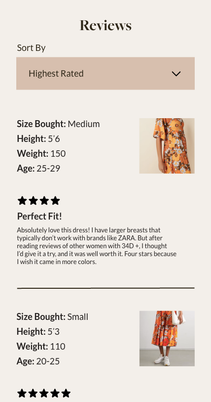
Interviewees shared three common desires when it came to online
shopping: a review section,
realistic
images, and a convenient
shopping process. A review section could build trust in knowing
what
to
expect before ordering. Realistic images of various body
types create diversity and a connection
between the brand and
shoppers. Lastly, being able to find items and purchase them
with ease
increases loyalty.
“Reviews are a huge indicator of whether or
not a product is good, reviews build trust.”
“In-store shopping feels more personal.”
“I appreciate images or videos of people
wearing clothes”
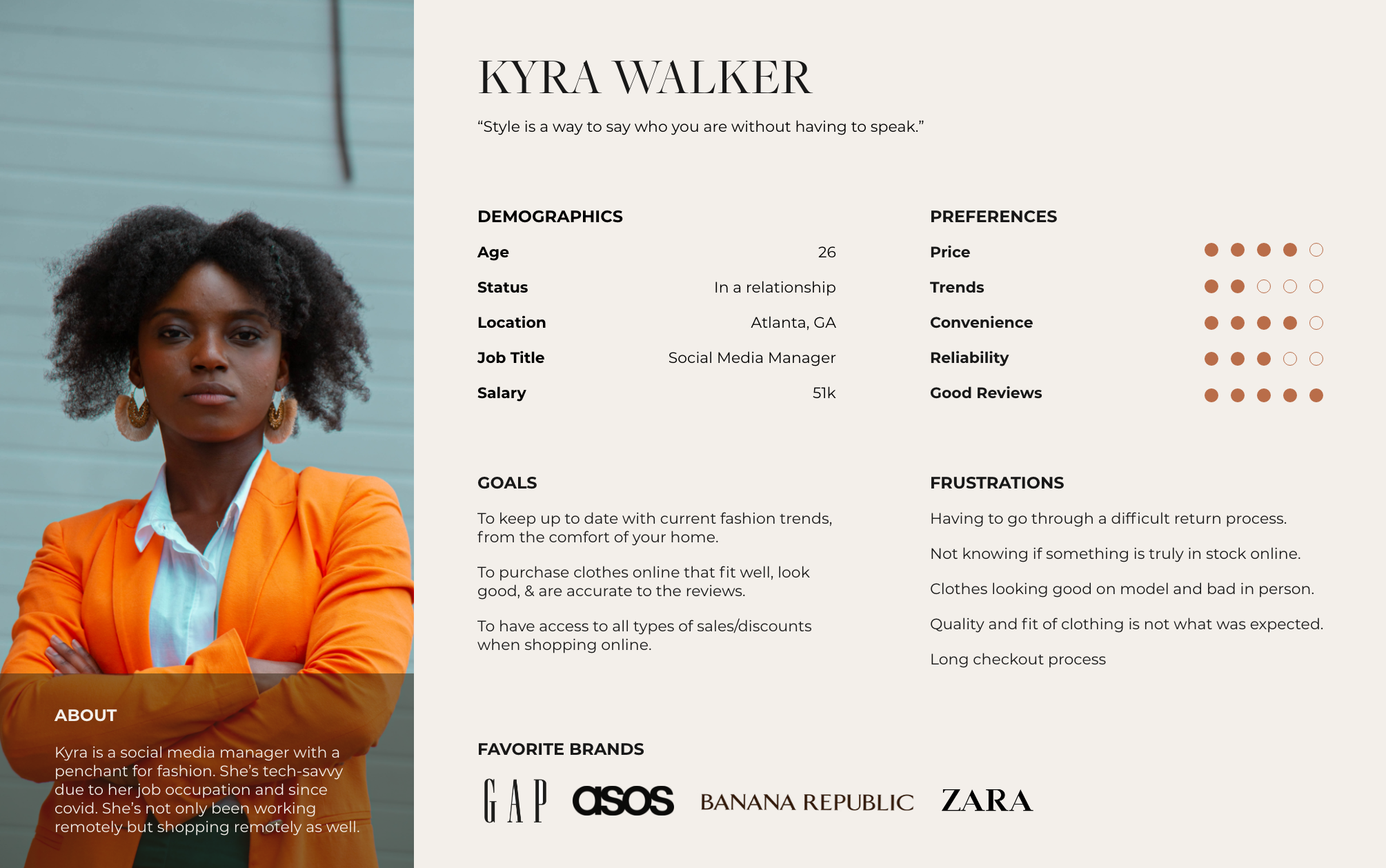
After compiling and analyzing our data, were able to create our user persona - Kyra Walker. Kyra is
a
social media manager in Atlanta. Since the start of the pandemic she’d been working remotely
and
shopping fashion statement pieces remotely. She depends on detailed reviews and realistic
images
when shopping online, because some well-known fashion brands have disappointed her
with
products that were well her expectations.
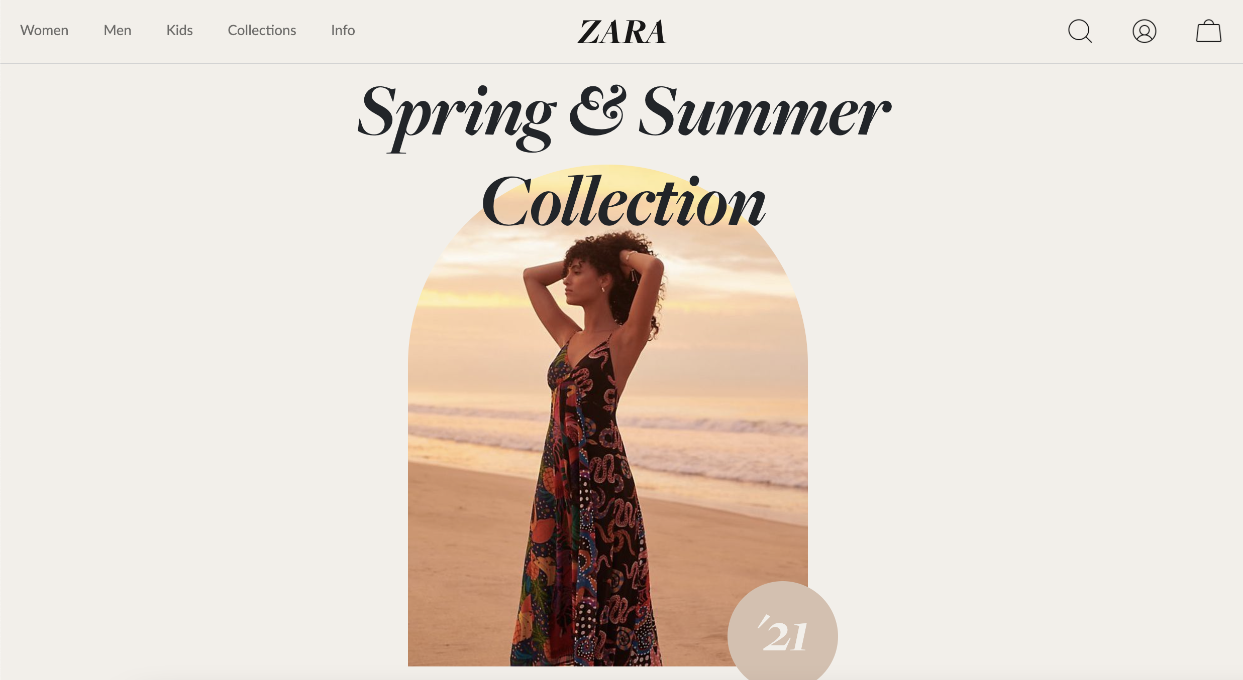
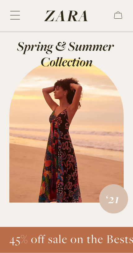
Modern aesthetic
with very simple
navigation bar.
Product page is clean
and informative when
assisting customers to
find their perfect size.
Energetic & eccentric
website design with
clear call to action
buttons.
We found that Zara’s website is difficult to navigate and excludes key features that create
a
personalized shopping experience. We believe that balancing aesthetics and practicality of
the
website would provide online-shoppers, like Kyra, wanting a convenient shopping
experience.
How might we restructure the navigation and add product features in a way that makes
Zara
customers feel confident in their online purchases?
Based on our interview and analysis, we saw an opportunity to broaden the
appeal to the homescreen,
by including sections that showcase collections, and sales.
To promote transparency, we added an
extensive
reviews section and a variety of
images of each clothing item on various body types.
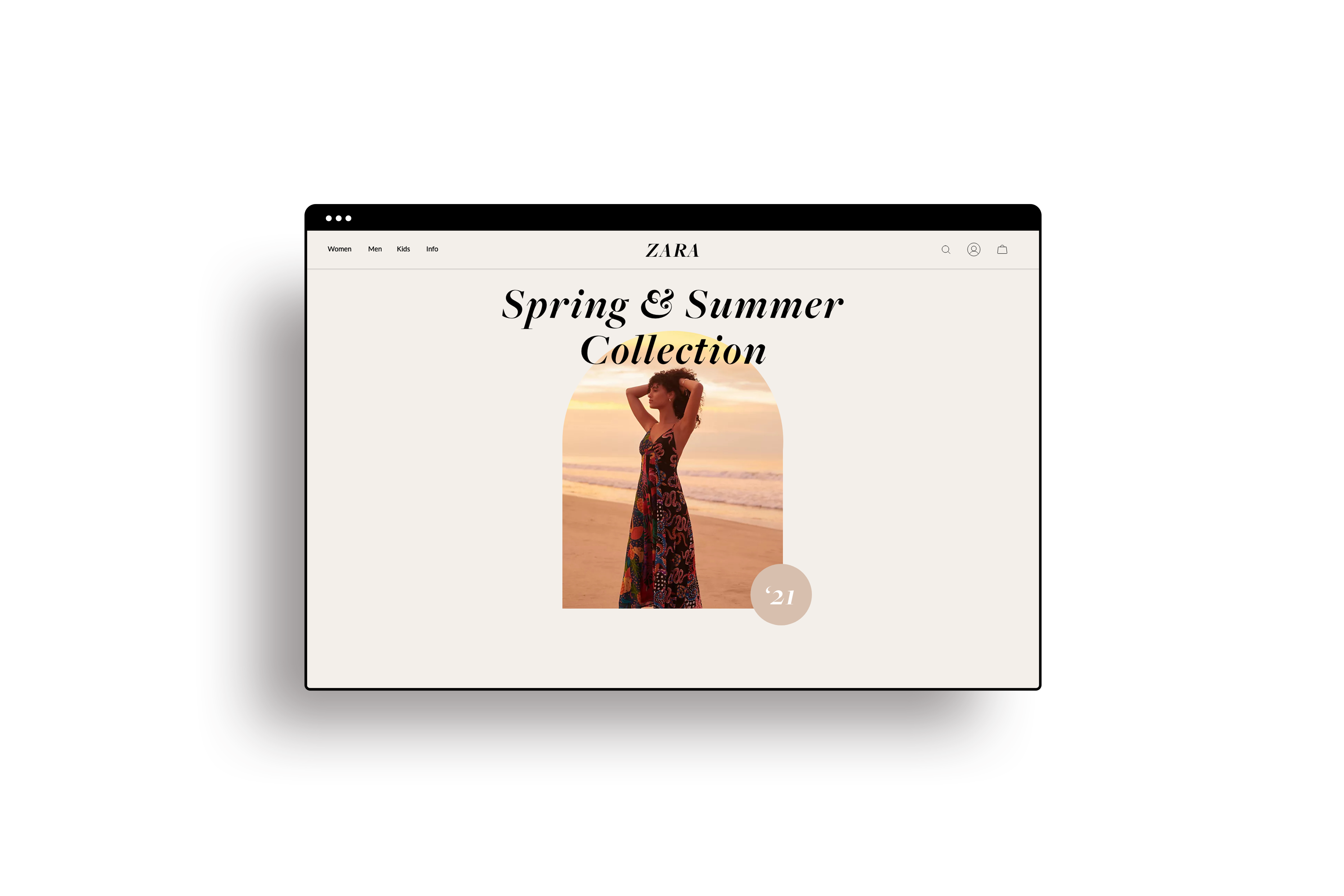
Modified Homepage with a bold editorial look that features
collections and sales.
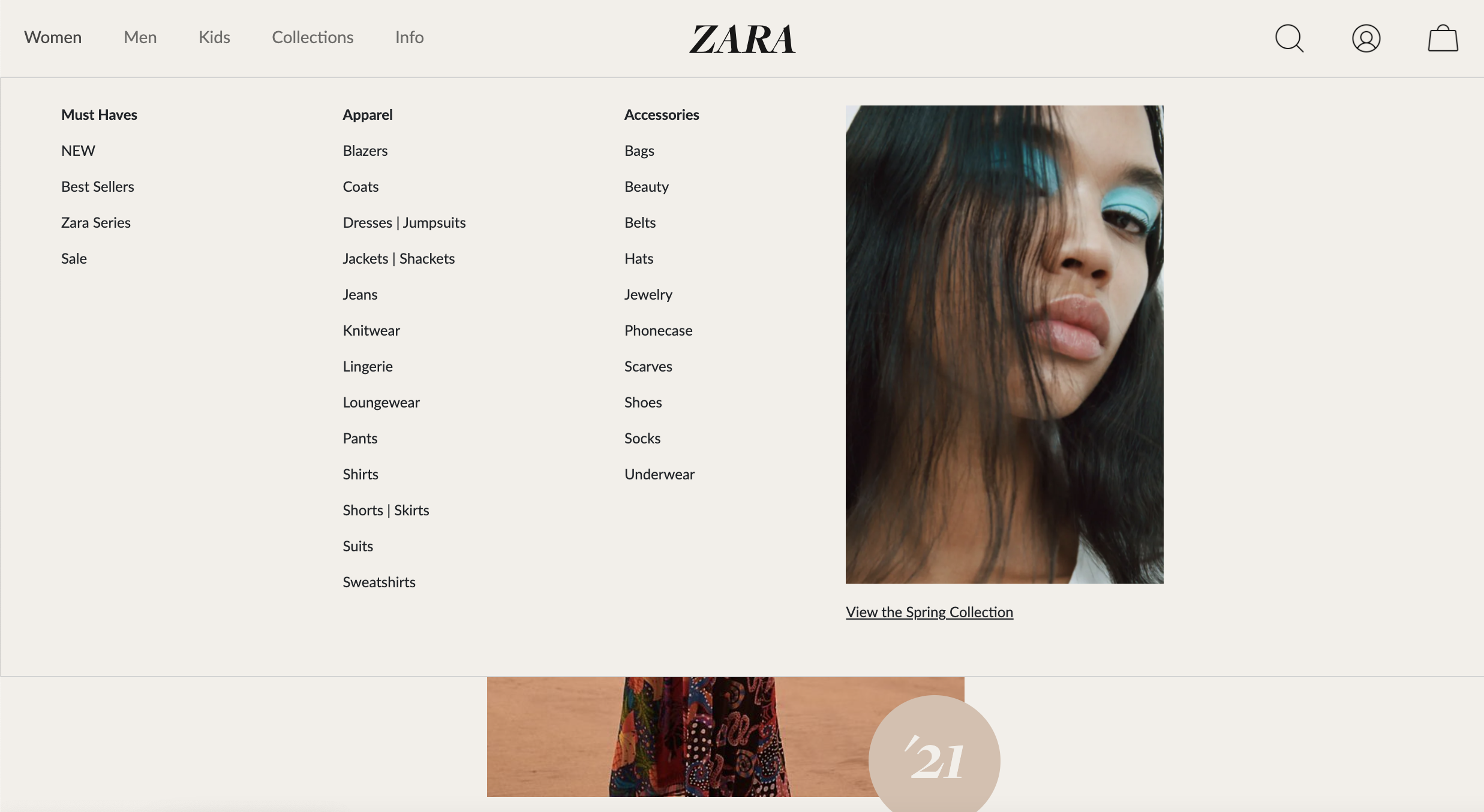
Simplified and restructured navigation that is
easy to read and navigate.
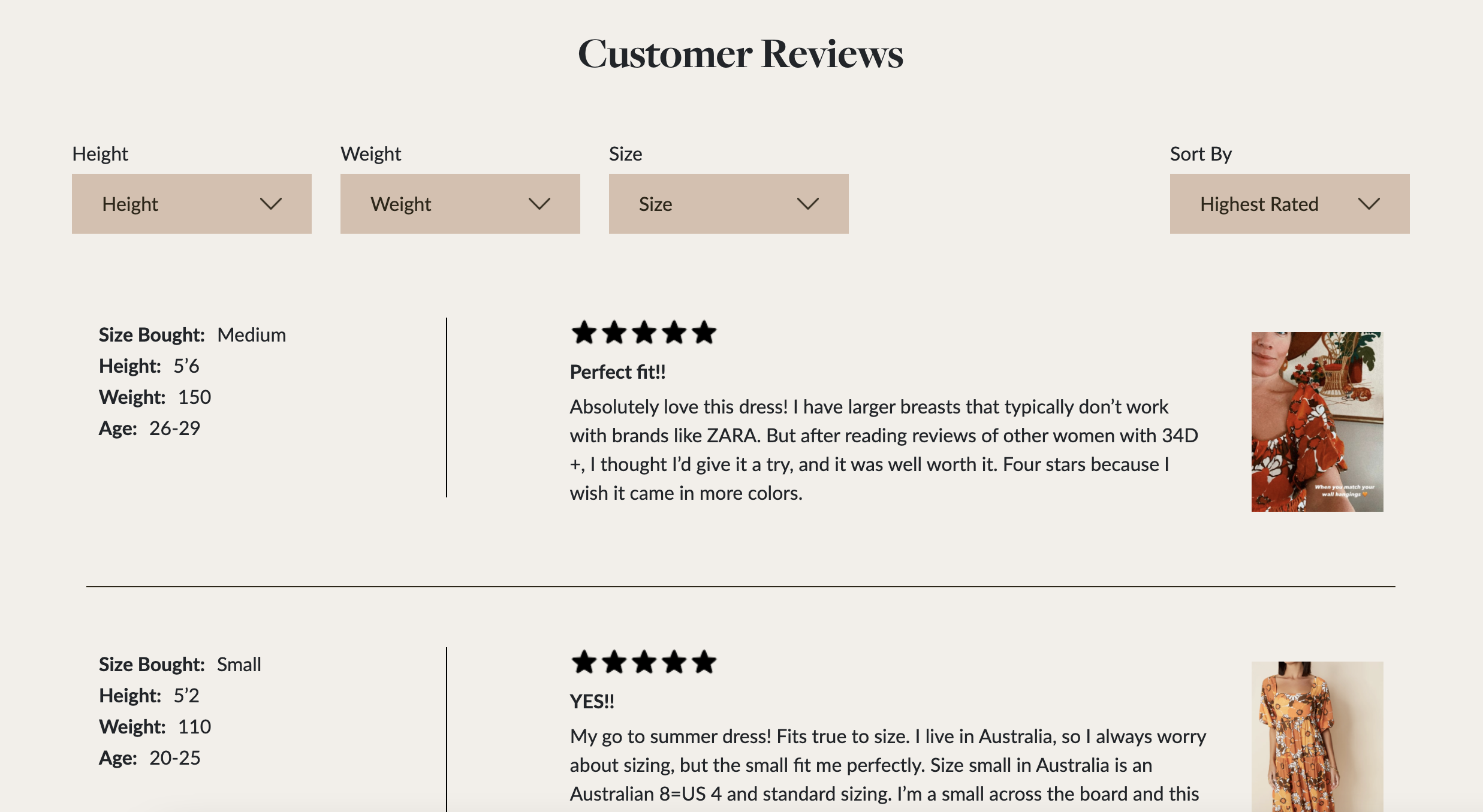
Detailed Review Section with body type information,
various reviews, and customer photos
Primary Header

Secondary Header

Color Palette

Sleek and minimalistic while still keeping a high fashion aesthetic. Our colors are neutral,
timeless
and could go with any and all collections.

Three user tests were performed and the feedback received was overall very warm. The users
felt that the website was
fresh, honest and easy on the eyes. We did however receive feedback
regarding the responsiveness of the
website. Many users informed us that they primarily shop
on their phones so we ensured that viewing the
website on mobile was just as easy and simple
to navigate as desktop.

We found that customers preferred the online shopping process to be simple and
intuitive. We set to improve Zara’s website to increase sales from their online
platform by simplifying navigation, homepage/product page layout, and
adding features like detailed reviews to build trust between the company and
it’s consumers. In the future we hope to focus on making returns easy for online
shoppers through a paperless return system. The paperless return system would
utilize QR codes sent to the customer’s email and easily scannable off a phone, all
for free. We would test to see if free returns would be a cost effective way to build
trust with online shoppers.